
Inside Edo’s Print Trade: The Work Behind the Floating World
A Sharaku portrait or Hiroshige rainstorm began as a collaboration. Publishers, cutters, printers and booksellers made Edo’s famous images—and shaped what their audiences could see.
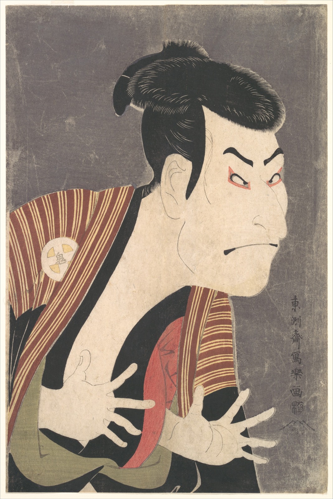
In 1794, Tōshūsai Sharaku designed a print of the kabuki actor Ōtani Oniji III in the role of the manservant Edobei. The face twists above two outstretched hands; the dark costume makes the exposed fingers particularly striking. The Metropolitan Museum’s impression still carries something of the expensive shimmer produced by mica in the background. Its subject belongs to a particular theatrical world, rather than to an anonymous gallery of “traditional Japan.”
Sharaku’s name now draws the attention. Yet the print reached its first buyers through a business headed by Tsutaya Jūzaburō, and its lines passed through the hands of block cutters and printers before anyone could buy a sheet. The image that looks so forcefully individual was the product of divided work.
This was characteristic of commercial ukiyo-e, the pictures associated with the pleasures, fashions and famous places of Edo-period cities. A designer supplied an image; a publisher judged its prospects and arranged its production; skilled workers made the image repeatable. The Met’s account of the process places those roles together. Treating the resulting sheet simply as a picture “by Sharaku” or “by Hiroshige” is convenient, but it conceals much of how it came into existence.
Following a print through that system changes what we notice. A fine strand of hair becomes evidence of cutting. A wash of colour records a printer’s judgement. A publisher’s mark points toward finance, distribution and responsibility before the authorities. Edo’s celebrated pictures were also objects made for sale.
Colour had a production history
Full-colour prints did not appear at the beginning of Japanese woodblock printing. Monochrome impressions, hand-applied colouring and printing with a restricted range of colours preceded the elaborate sheets called nishiki-e, or brocade pictures. The V&A traces this gradual development, including colour blocks in use before the major expansion of the technique around 1765.
That date is associated especially with Suzuki Harunobu and privately commissioned calendar prints. Patrons exchanged sophisticated New Year images in which calendrical information could be worked into the design. The University of Michigan Museum of Art explains how these deluxe commissions helped develop a richer palette and demanding printing effects, and how commercial editions followed. Innovation emerged through the interaction of patrons, designers and workshops; it cannot be reduced to one artist suddenly inventing colour.
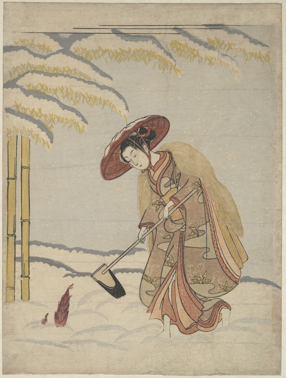
Harunobu’s woman digging bamboo shoots in snow, reproduced below, also makes a useful warning about the phrase “everyday life.” The Met identifies the design as a playful reworking of the Chinese story of Meng Zong, whose devotion to his mother was rewarded with bamboo shoots in winter. A fashionable woman replaces the exemplary boy. The picture combines an appealing contemporary figure with a learned allusion.
Such prints could ask a viewer to recognize two things at once: an attractive surface and the older story being transformed. Their consumers were not necessarily looking for a straightforward record of a street, a household or an occupation. Wit and recognition were part of the product. A historian who misses the allusion may mistake a visual joke for a report.
The publisher’s shop was a cultural business
The Japanese term hanmoto identifies the publishing enterprise at the centre of this trade. The Sumida Hokusai Museum’s study of producers describes responsibilities ranging from planning and hiring to distribution and retail. The publisher’s job involved recognizing an audience and committing resources before anyone knew exactly how a new title would sell.
Tsutaya’s career shows how broad that activity could be. Beginning in the orbit of the Yoshiwara licensed quarter, he moved his business to Nihonbashi in 1783 and worked with writers and artists across several genres. His firm produced illustrated fiction and poetry as well as single-sheet prints. After his death in 1797, a successor continued the name. “Tsutaya” on a publication can therefore identify an enduring business rather than the uninterrupted personal activity of its founder.
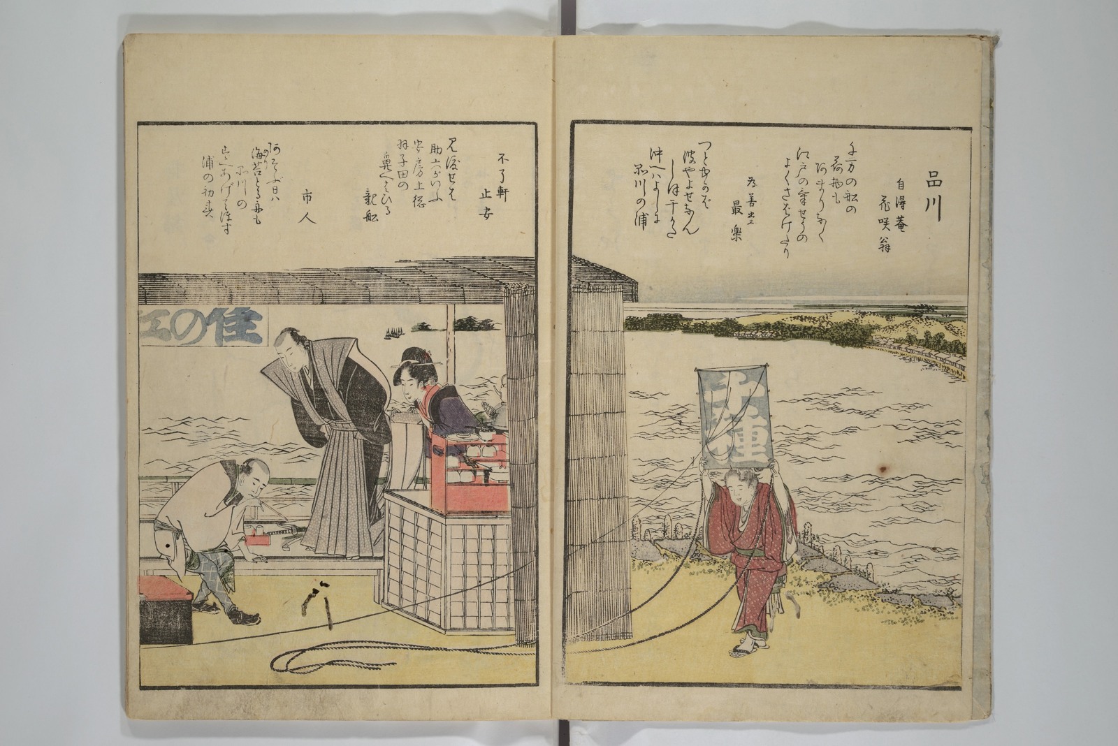
A shop image by Hokusai, first published in 1799, reveals that mixture of production, display and self-promotion. In chief curator Kenji Hinohara’s reading of the illustration, the sign and curtain identify the firm; books and prints occupy the shelves; advertised titles point readers toward more merchandise. The curator cautions that the apparent bookbinding at the storefront should not simply be accepted as a literal report of where the work occurred. Even an image of a bookshop could advertise its publisher’s range.
Nor did every reader have to buy a whole book. The Tokyo Metropolitan Library’s account of Edo bookshops places circulating libraries alongside publishers and retailers. The commercial culture included expensive illustrated volumes, cheaper reading matter and ways of gaining access without outright ownership. Calling ukiyo-e “popular” should not erase these differences.
Hokusai’s Fine Views of the Eastern Capital at a Glance of 1800 belongs to this wider world of colour-printed books. Its existence helps restore the connection that a museum display of isolated sheets can obscure: the same publishing culture sold pictures to handle, pages to turn and stories to read.
The hands between the drawing and the print
A finished design was not yet a printable object. The block-ready drawing was attached face down to wood, and cutters removed the surrounding surface so that the intended lines remained raised. Cherrywood’s fine grain and durability made it well suited to delicate work. The drawing used in cutting was normally destroyed in the process. Surviving preparatory material therefore represents only a partial record of the decisions that came before the finished sheet.
From the outline block, proofs provided the basis for the colour blocks. Registration marks, known as kento, guided the repeated placement of the paper. Without this coordination, colour areas would drift from the outlines. The method explains both the apparent clarity of the finished image and the precision demanded of people whose names are often less visible than the designer’s.
The Asian Art Museum’s technical account follows the next stage: printers brushed pigment onto the blocks, laid damp paper against them and rubbed the back with a baren, a hand tool traditionally covered with bamboo sheath. Colour arrived in successive impressions. A sheet did not pass through a mechanism that automatically delivered all its colours at once.
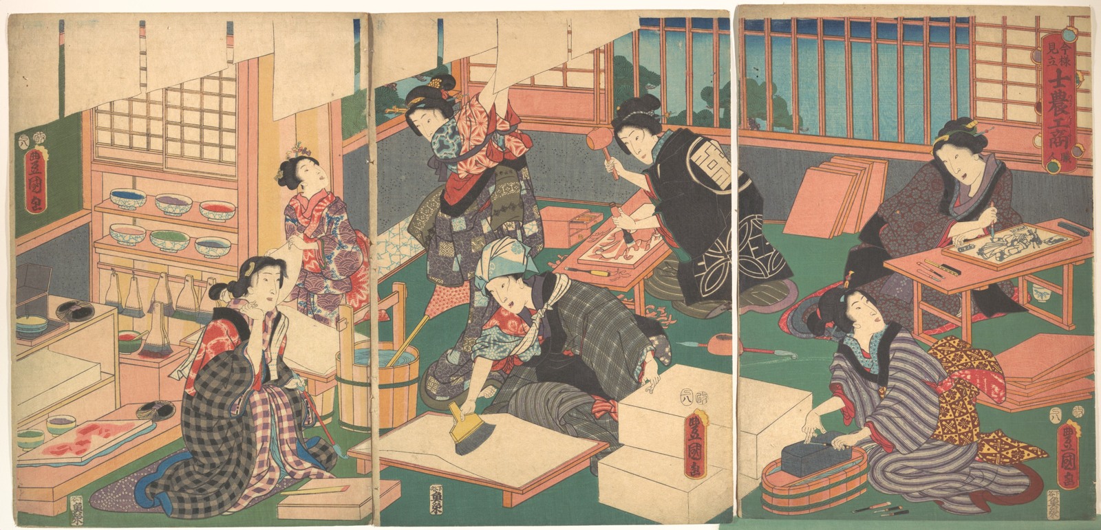
Kunisada’s Artisans makes these operations unusually visible. The Met’s description of the triptych identifies fine-line cutting, the removal of unwanted wood, paper sizing and a printer waiting at the working area. But the women performing these activities are a deliberate substitution within a playful series about the social classes. The British Museum dates the design to 1857 and classifies it as mitate—an imaginative reworking or comparison.
The scene can help us recognize tools and stages. It cannot, by itself, establish the gender balance, conditions or pace of a typical workshop. That distinction lets an illustration illuminate work without turning it into a photograph it was never meant to be.
A printer could make the weather
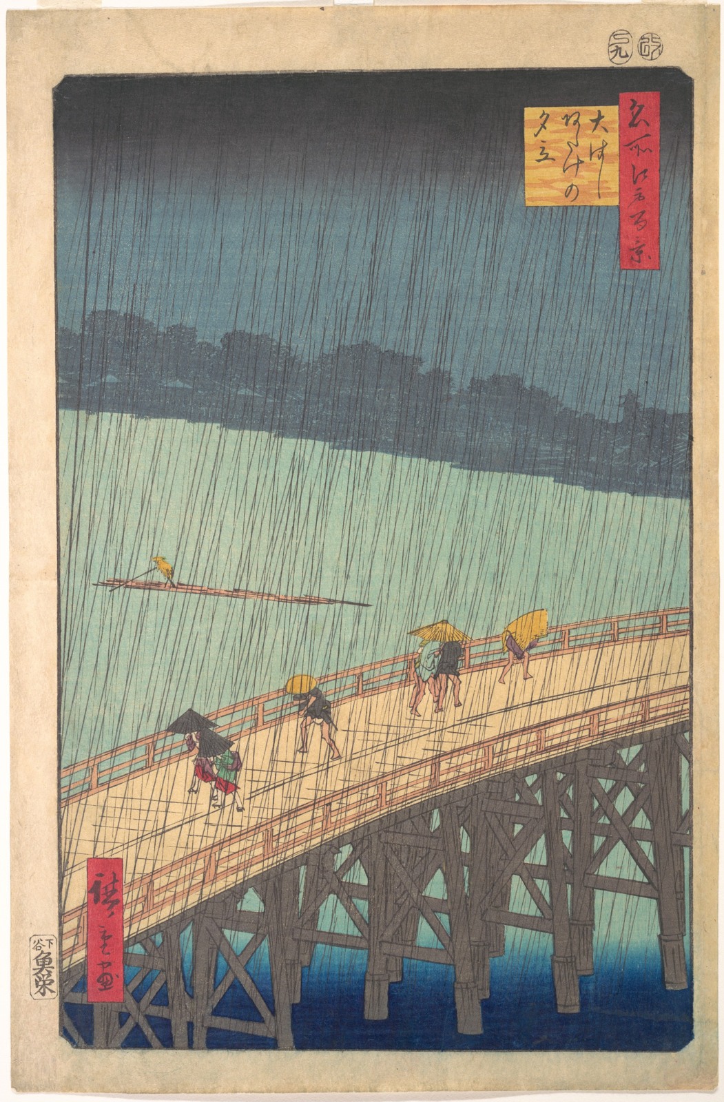
Consider the dark sky in Hiroshige’s Sudden Shower over Shin-Ōhashi Bridge and Atake, published in 1857. The bridge cuts across the sheet; figures bend under the rain; the river and distant shore occupy different tonal worlds. The fine slanting rain is itself a formidable cutting and printing problem. The Met’s commentary on another impression draws attention to the difficult intersecting lines.
The fading tone of a sky belongs to a different kind of skill. Bokashi, or gradation, required controlled manipulation of pigment during printing. As British Museum curator Alfred Haft explains in his account of workshop technique, the effect had to be renewed by hand, so impressions were not identical. The printer was exercising judgement each time, not merely transferring a fixed coloured surface.
Materials changed the possibilities too. Plant and mineral pigments had long supplied colours, while imported synthetic Prussian blue became especially influential from the late 1820s. Its availability expanded the resources of designers and printers. The visual history of ukiyo-e consequently includes trade and chemistry as well as the stylistic careers of famous artists.
These facts complicate the distinction between an “original” and a “copy.” A design could exist in many contemporary impressions, with differences arising from colour choices, printing quality, wear or later reuse of blocks. Later recut reproductions present another question again. A museum’s date for the design does not automatically tell us everything about the making of a particular sheet.
The impression reproduced here is the Met’s JP3174. Identifying it precisely is more useful than treating every online image of Hiroshige’s rainstorm as interchangeable. Close looking begins with knowing which object we are looking at.
Risk, regulation and the survival of a sheet
The commercial ambition of publishers operated within political limits. The Kansei reforms brought restrictions on publishing, and in 1791 Tsutaya was severely fined for issuing works by Santō Kyōden. The National Diet Library material presented through Japan Search describes the penalty as half his fortune and connects it with a contraction in lavish illustrated publishing. Government action could change what a workshop was able to produce by striking at its financial base.
Censorship was therefore more than a stamp added to an otherwise independent artistic process. The publisher who financed a title also faced consequences for its content. Decisions about subjects, format and investment took place with both customers and authorities in view. This does not mean every fashionable image concealed political rebellion. It means the conditions of publication belong inside the history of the image.
For buyers, prints could carry recognition, desire and local knowledge. The Tokyo Metropolitan Library describes nishiki-e as information media: actors in current roles, prominent wrestlers and changing fashions were among their subjects, while visitors could take away pictures associated with Edo. The city could circulate in paper form beyond the places depicted.
What survives, however, is not a balanced sample of everything sold. Repeated handling, use and disposal affected which objects lasted. The V&A notes the particular vulnerability of fan prints: paper images attached to practical objects had lives different from sheets kept carefully in albums. Present-day collections reflect preservation and collecting as well as original popularity.
Returning to Sharaku’s actor, the hands in the image remain arresting. Yet there are other hands to consider: the cutter preserving a narrow ridge of wood, the printer controlling pressure and pigment, the bookseller arranging stock. Their work does not diminish the designer’s achievement. It explains how that achievement could leave the drawing table, enter a shop and become part of someone else’s everyday life.